Making a housing loan application less painful
For many Saudi families, a subsidised housing loan is the biggest financial decision they will make. My job was to redesign the applicant’s journey so people could get through it without help, and so fewer applications came back to the review team with mistakes.
- Profile fields pre-filled via Nafath
- ≈60%
- Application stages
- 4
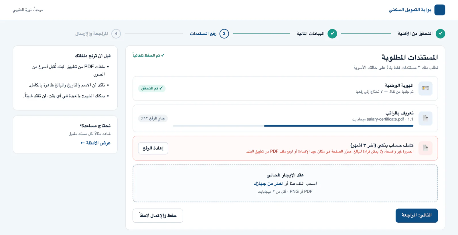
Step 3, documents. The ID is already verified through Nafath. Each file shows its own state, and an unreadable bank statement explains how to fix it.
I don’t have the original applicant screens, so the screens on this page are recreations. They follow the same flow and rules I designed; names and numbers are sample data.
What was going wrong
One very long form. Dozens of financial and legal fields on one page. People got tired, timed out, or left.
Small mistakes caused long delays. A National ID in the wrong format or a salary slip nobody could read wasn’t caught on submit. A reviewer found it days later and the applicant started an email back-and-forth.
Silence after submitting. Applicants couldn’t see where their application was, so they called the support centre, often more than once.
Going through the lending policy with the client’s experts, I learned that most rejections weren’t about eligibility. They happened because upload requirements were unclear and nobody told applicants what was wrong while they were still filling in the form.
What I designed
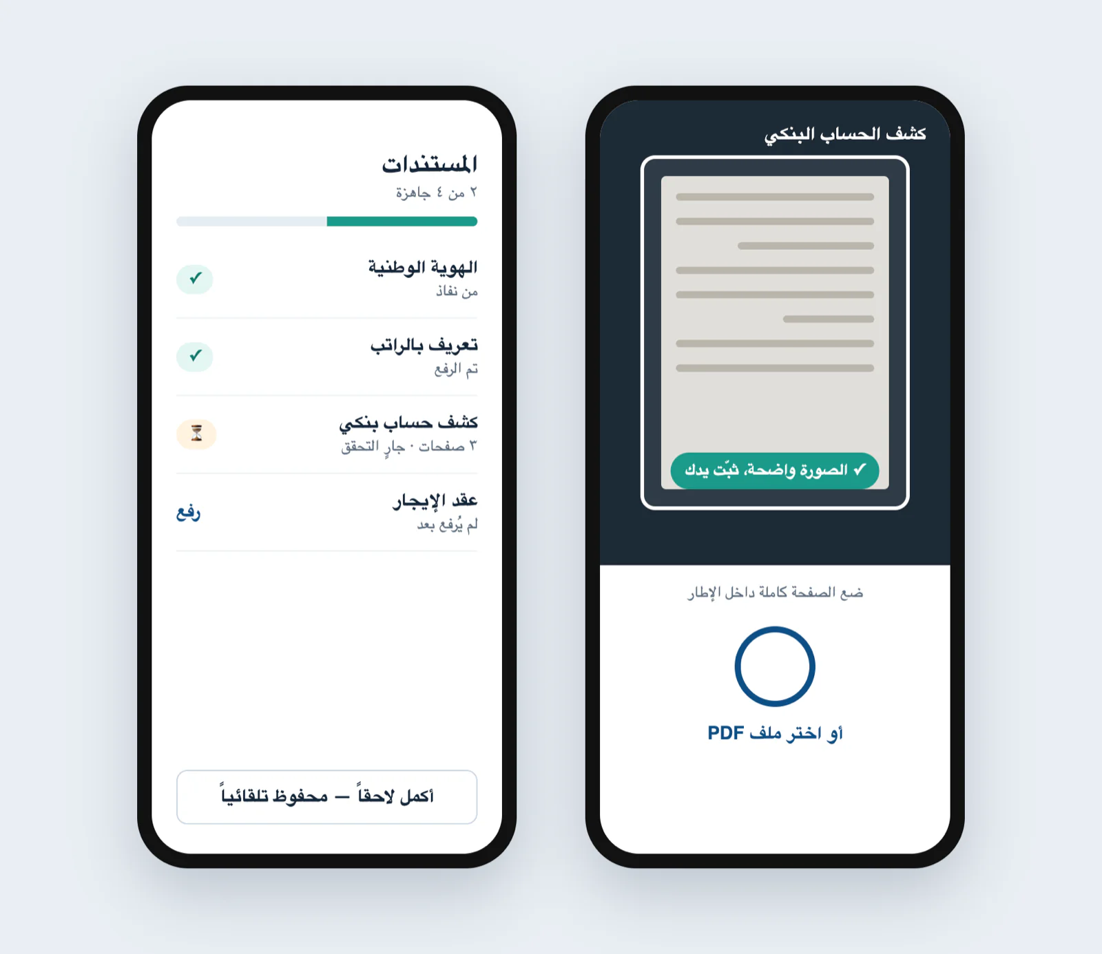
- Four clear stages: eligibility, financial details, documents, final review. Extra questions only appear when the household needs them, and everything saves automatically.
- Mistakes caught while typing: a 10-digit National ID, IBAN formatted as you type, and uploads that say exactly what’s accepted (PDF or PNG, under 2 MB).
- Nafath pre-fill: verified name, ID and date of birth come in locked, covering about 60% of the basic profile fields.
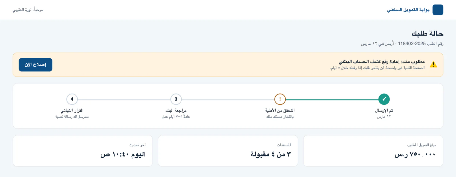
- A status page that shows each stage and links straight to any document that needs fixing.
The decision I had to argue for
The policy owners wanted every checkpoint visible to every applicant, because it made audits feel safer. I kept the journey to four stages, with extra questions only when they apply. Audit confidence comes from locked, verified data and a clear final review, not from showing people questions that don’t apply to them.
The other side: managing loan contracts
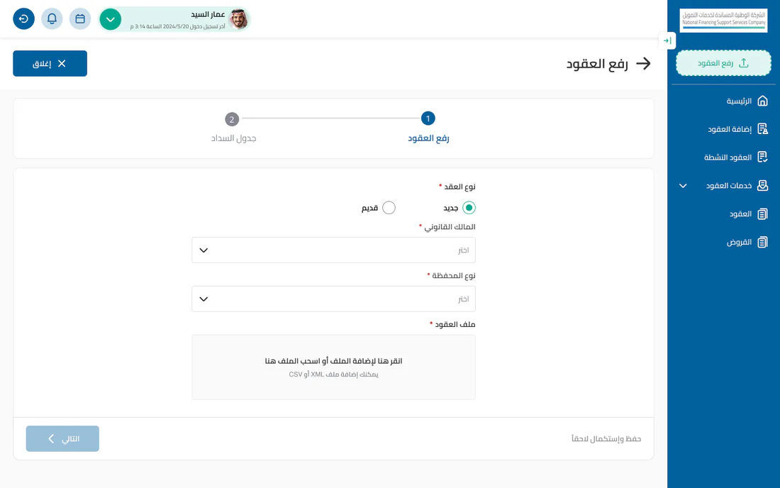
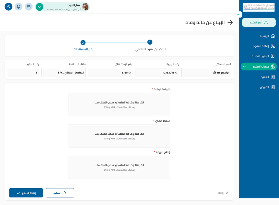
I also designed screens for the financing team once loans are active, such as uploading contract files and reporting a beneficiary’s death. The same ideas carry over: short steps, data carried forward and locked, and only the documents each case needs.
What I’d measure next
The project ended before I could collect proper numbers. Next I would track where people pause and come back, which documents get rejected most, and whether support calls go down per submitted application.